Using shapes within your home in different contexts can make your home look like it was designed by a professional. Designers use shapes in various techniques to help add depth and style.
We've created a list demonstrating how shapes affect your design and how different industries use shapes creatively. We hope this list inspires you to use shapes in your home.
Balance
Playing with shapes in design, you may think it will appear off-balance, but quite the opposite happens. Using shapes within interior design helps maintain the balance of the room. Geometric shapes and patterns can be used in wallpaper, lights, and tables to achieve balance in a room visually.
Within architecture, balance means more than a building standing soundly on its own. Balance is critical in function but also aesthetically. Visually, symmetry is the quickest way to achieve balance. Architectural balance means designing for all senses, so not only does it look balanced, but it feels balanced as well.
Basic shapes in architecture are the fabric of symmetrical design. Rectangles, squares, and triangles are beautifully woven into the most intricate building designs. Squares and rectangles are exceptionally easier to use in design. Altered shapes create waste and use more materials, making them unsuitable for design.
Using shapes and balance within our design at Viaggio, we draw inspiration from creative design works. Our Quadrato collection utilizes sharp 90-degree angles, creating visually striking square rosettes and knobs. Pair with a smooth lever for a balanced, intriguing design.

Visual Interest
Visual interest is a crucial element in excellent design. Visual interest is not only engaging but captivating. In interior design, utilizing shapes in creative methods adds depth to an otherwise bland design.
When designing a room, use squares or rectangles when choosing coffee tables or shelves. The hard corners of a table can be balanced with softer circles and ovals used in pillows or decor objects. The contrasting shapes help to add visual interest without becoming too busy.
In architecture, visual interest can be achieved in a contemporary home through the creative use of shapes. Stacking rectangles and squares in unique combinations helps to give a home show-stopping curb appeal.

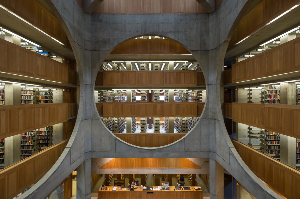
Kahn was commissioned in 1965 to design the Philip Exeter Library. Drawing inspiration from dramatic geometric shapes, Kahn created an incredibly striking design focused on natural light. Kahn structured the library in three concentric square rings. The outer ring – built of load-bearing brick – includes all four exterior walls and the library reading spaces. The middle ring – made of reinforced concrete – holds the heavy book stacks. The inner circle is a dramatic atrium with enormous circular openings cut out of its walls. The visual interest created through geometric shapes has no doubt been achieved.

We've achieved visual interest through our product design by playing with shapes. Our Circolo Collection features perfectly circular, smooth edges in our backplates and knobs. Our Circolo Crystal Knob is a contemporary twist on a classic crystal design. Choose from various finishes to find the right style for your home.
Golden Ratio
Mathematicians were right when developing the ratio of corporations. The golden ratio is seen frequently in architecture and interior design. It means approaching your space in either one-third or two-thirds sections.
The golden ratio exists in nature and is replicated throughout design and art. Using balance and symmetry in a calculated method, the golden ratio creates visual interest immediately. The golden ratio is the perfect guideline for any design through shapes.
Architects use the golden ratio to create an array of shapes, from pentagons to icosahedrons. Understanding the use of the golden ratio and shapes creates visually stunning works of art.
The golden ratio is ideal for creating a room's layout in interior design. Keep the ratio 2:3 in mind when arranging furniture, use square coffee tables or circle side tables, and utilize negative space. Don't break the room into quarters or halves; your room will begin to take shape.
You can see the golden ratio within our product design. Using shapes in our backplates, we can apply the golden ratio. Our Circolo Rosette, matched with a Brezza Lever, creates the ideal 2:3 design.
Use Shapes in Your Home
Using shapes to create balance, visual interest, or the golden ratio can help you design your home like a proper design professional. Consider taking risks with the shapes in your furniture, art, and even hardware.
Italian designs inspire our luxury hardware designs with clean lines and geometric shapes. Choose from the Circolo or Quadroto Collection to add geometric designs to your home.
Shop Hardware


